Last week, I received a ping from one of my clients’ references, and he asked to create a logo for his hospital. I asked for his name and specialization. Usually, people think logo designing requires the latest tools and tricks, but I will focus on Logo designing through this blog.
Many of us are having a misconception that logo designing doesn’t take much effort and time. People usually think all you need a few graphic tools with predesigned patterns.
You will add the name and right color coding. Your final logo is Over!
Despite this, we need to keep a couple of things in mind before designing a logo.
So let’s Objectivate the purpose of Logo designing.
The Logo signifies the Identification of your Brand, Business, Company, Organisation, or Enterprise.
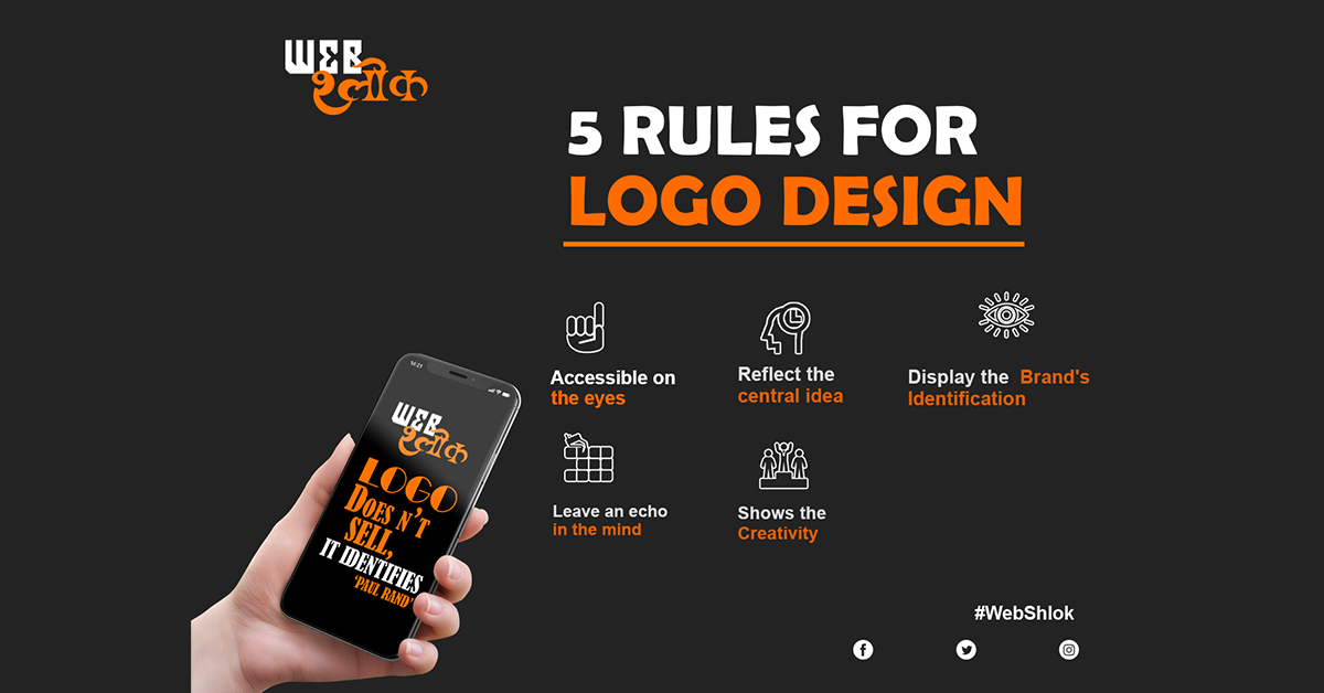
The 5 Do’s for logo designing:-
Design your Logo in a way that steals the show in a competitive market.
Easy on the eyes
It must be easy on the eyes and indicate the title's right echo from its design and color. The colors and words relate to each other.
Depicts the main Idea
It should pictorially reflect the central idea of your brand or business. It should be memorable and innovative.
Thorough research
It takes a lot of creativity and research to design a logo that separates a brand from the competition.
Leaves Electrifying effect
To grow your business and brand to heights, try to devote time to creating a logo that leaves a lasting impression as it appears first before anything else.
Make your own trend
Don't limit your thinking based on trends in the market. There is no such trend in the market for logo designing.
Many people having small businesses or startups prefer an online template for logo designing, and that too works well but doesn’t have a lasting effect on their clients.
Why am I stressing on designing logos by putting your imagination and thoughts?
It is the symbol that comes before the name of your company and you.
In your website, business card, pamphlet, or visiting card, its evident Logo would come on this. If a logo appears on all-important transaction documents, why not design it that stamps your client’s memory.
Stop using templates directly to your logo. It kills your imagination you could put on designing your logo. You may use a template to get an idea for creating but remember this; using the direct template could match with any other company logo.
The 5 Don’t for logo designing:-
Certain points may turn your logo dull
Doesn't harm sensitive values
It should not create a hindrance to any caste or religion. Otherwise, your business or brand may get entangled in the wrong discussion.
No Plagiarism
Never copy anyone's design or tagline because you like it. You have your own identity and let it reflect as you.
Overuse of colors
Don't add extra colors to your logo. Try to use 2 to 3 colors. Using more than three colors, many confuse the viewer.
Don't use extra words
Avoid extra and worthless words on logos. If it doesn't require any tag line, it's better to don't add.
Don't misalign text with icon
Don't use more than 25 characters in the tag line. Make sure your Icon aligns with that of the text.
There’s more to this than meets the eye exactly justifies the art of Logo designing.
It looks easy, but it’s surprisingly complex to sketch a logo.


